
A Pareto chart, named after the economist Vilfredo Pareto, is a type of chart that combines both bar and line graphs as shown below.
It is used to represent and analyze data to identify and prioritize the most significant factors or causes contributing to a problem or outcome.
The primary purpose of a Pareto chart is to apply the Pareto principle, also known as the 80/20 rule, which states that roughly 80% of the effects come from 20% of the causes. This principle suggests that a small number of factors are responsible for most of the results or issues in a given situation.
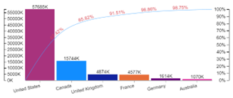
Let us take an example, sales by product shown below.

If you look at the above Pareto chart, you can see that 85.99% of sales come from the three products: Mountain Bikes, Road Bikes, and Mountain Frames, while the remaining 14.01% of sales are coming from other products
Overall, Pareto charts provide valuable insights into data distribution, prioritization, and decision-making. They are versatile visual that can be applied in various contexts, ranging from business operations and quality management to problem-solving and process improvement.
Click here to see how to implement a Pareto Chart in Power BI
How does the Pareto chart help businesses?
Pareto charts can help businesses in a variety of ways, including:
Identifying the most important problems or causes: Pareto charts can help businesses to quickly identify the problems or causes that are having the biggest impact on their bottom line. This information can then be used to prioritize resources and focus on the most important areas for improvement.
Prioritization: Pareto charts help prioritize the most significant factors or causes. By identifying the vital few elements that contribute to a problem or outcome, you can focus your efforts and resources on addressing them first. This allows for efficient resource allocation and helps maximize the impact of interventions.
Make better decisions: Pareto charts can help businesses to make better decisions by providing them with a clear understanding of the most important problems or causes. This information can help businesses to choose the most effective solutions and to allocate their resources in the most efficient way.
Communicate their findings to others: Pareto charts are a simple and easy-to-understand way to communicate findings to others. This can be helpful when businesses are trying to get buy-in for their solutions or when they are trying to educate others about the problems that they are facing.
Here are some specific examples of how Pareto charts can be used in business:
Identifying the most common customer complaints: Pareto charts can be used to identify the most common customer complaints. This information can then be used to prioritize resources and focus on resolving the problems that are causing the most customer dissatisfaction.
Identifying the most expensive defects: Pareto charts can be used to identify the most expensive defects. This information can then be used to prioritize resources and focus on preventing the defects that are causing the most financial losses.
Identifying the most time-consuming tasks. Pareto charts can be used to identify the most time-consuming tasks. This information can then be used to prioritize resources and focus on streamlining the tasks that are taking up the most time.
What an insightful article! Your ability to break down complex topics into easily understandable points is truly commendable. I appreciate the thorough research and the engaging writing style that keeps readers hooked from start to finish. For anyone who found this piece as fascinating as I did and is eager to dive deeper into related subjects. Thank you for sharing your knowledge and providing such valuable content. I look forward to reading more of your work in the future!
Great article! I appreciate the clear and insightful perspective you’ve shared. It’s fascinating to see how this topic is developing. Looking forward to hearing others’ thoughts and continuing the discussion!
Excellent content! The way you explained the topic is impressive.